You ship a settings page with a row of 3D icons. It looks good. Then someone flips the theme toggle, and the camera icon is gone. Not faint, gone. The dark lens body that read beautifully on a near-white page is now sitting on a near-black page, and there is nothing left to see.
I wanted to know how often that actually happens, so I stopped guessing and measured it. I pulled 59 icons from Thridy's own CDN, decoded every pixel, and computed the contrast of each one against the two backgrounds we use across the site: #faf9f7 and #171613. The answer surprised me enough that it changed how I think about shipping an icon set at all.
How I measured it
Every icon came from cdn.thridy.com as a WebP file, either 512x512 or 1024x1024, with a median file size of 30,240 bytes. I decoded each to RGBA and kept only the pixels with an alpha of 128 or higher, so I was measuring the icon and not the transparent canvas around it. Each surviving pixel got converted to its WCAG relative luminance. The median of those became the icon's body tone, and I computed the contrast ratio of that tone against each background.
Median coverage was 29.5% of the canvas, so roughly seventy percent of a typical 3D icon file is empty space. That matters later.
Every icon works somewhere. Only 29% work everywhere.
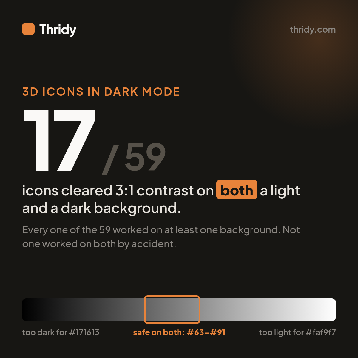
Against #faf9f7, 21 of the 59 icons landed below a 3:1 contrast ratio. Against #171613, 21 of 59 landed below 3:1. Those sound like the same result until you check which icons they are. They are different icons. Zero of the 59 failed on both backgrounds, and 17, or 29%, cleared 3:1 on both.
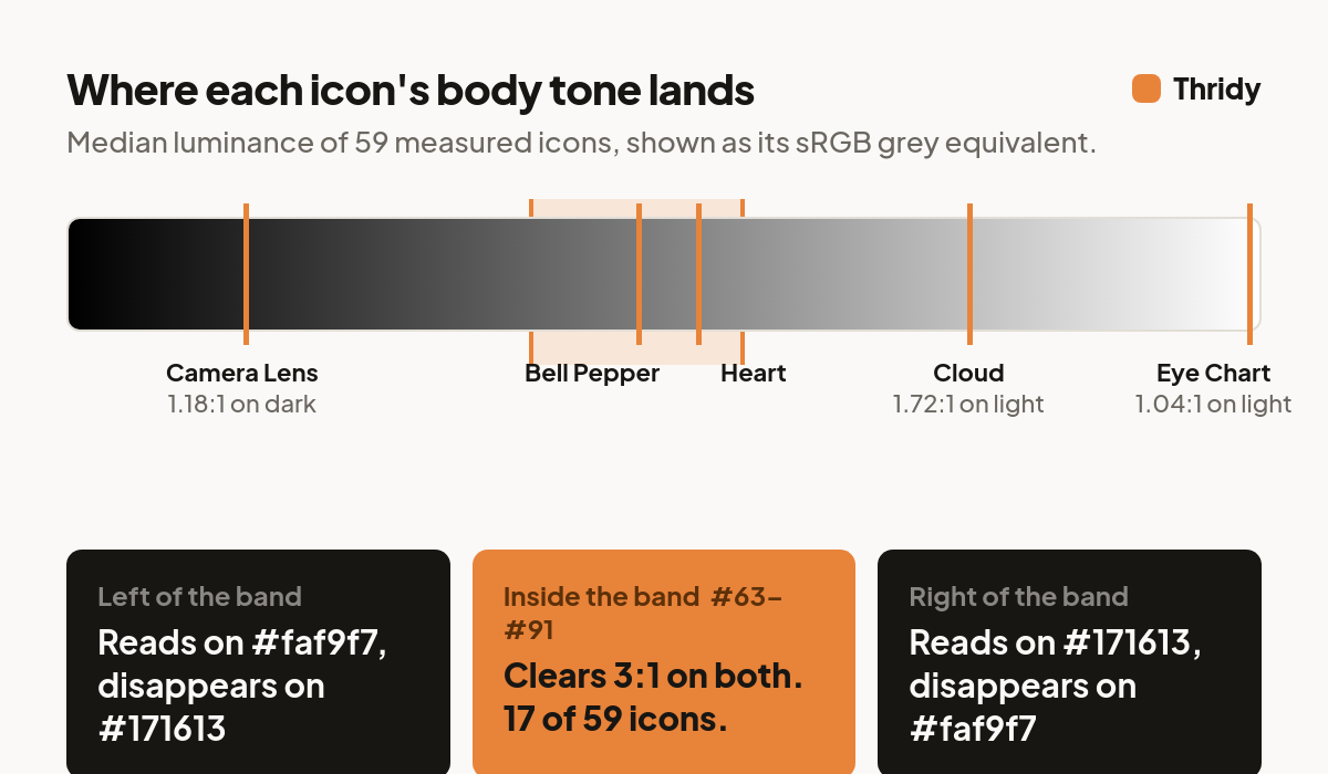
The extremes are stark. Camera Lens has a body luminance of 0.019, which gives it 14.54:1 on the light background and 1.18:1 on the dark one. Eye Chart sits at the other end with a luminance of 0.989: it scores 1.04:1 on light and 17.91:1 on dark. Cloud, a pale icon, manages only 1.72:1 on #faf9f7. Heart, at a luminance of 0.240, clears both at 3.44:1 and 5.00:1.
So there is no such thing as a dark-mode-safe icon set. There are only dark-mode-safe pairings of an icon and a background. Asking "does this library work in dark mode" is the wrong question, because the library does not have one answer.
The 4.5:1 window does not exist
Here is the part I did not expect. Once you fix your two backgrounds, you can solve for the range of icon tones that clear a given contrast ratio on both, and that range is narrow.
#faf9f7 has a relative luminance of 0.9479. #171613 has 0.0080. To clear 3:1 against the dark background, an icon needs a luminance of at least 0.1241. To clear 3:1 against the light one, it needs at most 0.2826. That leaves a real but thin window, 0.1585 wide, which in flat sRGB grey runs from about #63 to #91.
Now raise the bar to the 4.5:1 that people habitually quote from text contrast rules. Clearing the dark background needs at least 0.2111. Clearing the light background needs at most 0.1718. The lower bound is above the upper bound, so the window is empty. No flat tone clears 4.5:1 against both #faf9f7 and #171613. It is not hard, it is arithmetically impossible, and it stays impossible for any pair of backgrounds that far apart.
If you have been holding icons to 4.5:1 in both themes and wondering why nothing passes, that is why.
The standard only asks about the parts that carry meaning
The relevant rule is WCAG Success Criterion 1.4.11, Non-text Contrast, and it asks for 3:1, not 4.5:1. It applies to user interface components and to "parts of graphics required to understand content." Purely decorative graphics are exempt, as are graphics where a particular presentation is essential, like logos and photographs.
For a 3D icon, the part required to understand the content is the silhouette. The shading, the gradient down the side of the sphere, the specular highlight, none of that carries the meaning. That is decoration, and it is exempt.
So I measured again, this time on the silhouette only: the opaque pixels within two pixels of the alpha boundary, sampled at 256px. The rim was slightly kinder on average, at a median 3.88:1 on light and 4.43:1 on dark, but the pass rates got worse where it counts. 42 of 59 rims cleared 3:1 on the light background, 35 of 59 on the dark one, and only 18 of 59, or 31%, cleared it on both.
One more number worth sitting with: even among icons that pass, a median of 34.3% of their pixels fall below 3:1 on the light background and 30.1% on the dark one. That is fine. Those are the shaded faces, and shading is decoration. An icon does not need to be uniformly high contrast, it needs its outline to survive.
Size is not the problem
My first instinct was that small sizes were making this worse, so I tested it. I downscaled every icon to each of the embed sizes we serve and measured how much of its internal luminance variation, the thing that makes it read as a three-dimensional object rather than a blob, survived.
At 32px, icons retained 89.0% of the internal luminance spread they had at 512px. At 64px it was 91.9%, at 128px 93.4%, at 256px 97.4%. Re-encoded at quality 82, the median 32px icon is 862 bytes and the median 128px icon is 4,120 bytes, against 30,166 bytes at 512px.
The form survives the thumbnail almost intact. The contrast does not survive the theme switch. Those are two different failures, and shrinking or enlarging the icon does nothing about the second one.
The obvious fix is the worst one
The standard move is to put the icon on a plate: a rounded container behind it, so the icon sits on a surface you control rather than on the page. That works, because an opaque plate makes contrast independent of the theme entirely.
But the plate tone people reach for first is a neutral mid grey, and I swept every tone from #000000 to #ffffff to see how each one performed. The curve is a U, and it is deepest exactly where designers tend to aim.
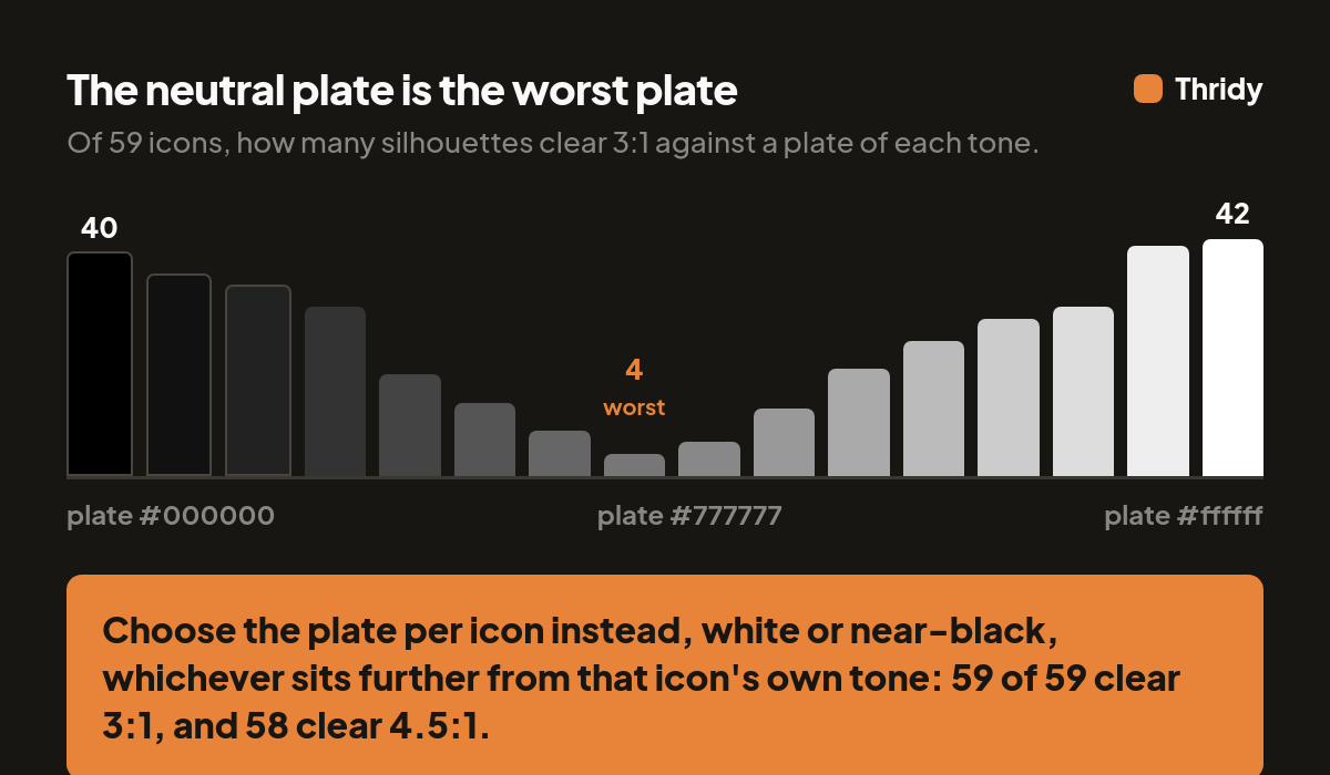
A #777777 plate let just 4 of 59 icon silhouettes clear 3:1, a 7% pass rate. #666666 managed 8. #888888 managed 6. Meanwhile a plain white plate cleared 42 of 59, and pure black cleared 40. The reason is simple once you see it: the median icon rim luminance is 0.207, which is itself a mid tone. A mid-grey plate is the one tone guaranteed to sit closest to the thing you are trying to separate it from.
What actually works
Pick the plate per icon rather than per design system. For each of the 59 icons I took whichever of #ffffff or #0d0d0d sat further from that icon's own rim luminance. All 59 cleared 3:1, and 58 of 59 cleared 4.5:1, the threshold that was mathematically unreachable without a plate.
The split was almost even: 30 icons wanted a light plate, 29 wanted a dark one. That is the whole trick. You are not choosing a plate colour for your product, you are choosing one bit of information per icon.
So, concretely:
If your icons sit directly on the page, filter your set by luminance and keep only the ones in the dual-safe band, roughly #63 to #91 equivalent. Expect around 29% of a general-purpose set to qualify, so plan on picking icons for tone as deliberately as you pick them for subject.
If you need the whole set, give every icon an opaque plate and store the light-or-dark choice alongside the icon. It is one boolean per asset and it makes the theme irrelevant.
Do not reach for a neutral grey plate, and do not hold icons to 4.5:1 across two themes, because that target does not exist. Aim at 3:1 on the silhouette, which is what the standard actually asks for.
Finally, measure against your own backgrounds. Every number here is specific to #faf9f7 and #171613. If your dark theme is #0a0a0a or your light theme is pure white, the safe window moves, and the only way to know where it moved is to run the same measurement on your own palette.
Free 3D icons for this
Every icon on Thridy is free to download and use. A few that fit this piece:
- Cursed Medallion 3D icon
- Dark Matter Detector 3D icon
- Demonic Skull 3D icon
- Sword 3D icon
- 20 Euro Note 3D icon
- African Pot 3D icon
Browse all 2,600+ free 3D icons or explore them by category.